Most performance optimization starts with a guess. Someone reads that images should be lazy-loaded, adds the attribute everywhere, and declares the site fast. Chrome DevTools' Performance panel replaces guessing with evidence — a frame-by-frame trace of every JS call, layout, paint, and network request, all on one synchronized timeline. If there's a bottleneck, it's in there. You just have to learn to read it.
Open DevTools alongside this article. Press F12, go to the Performance tab, record a quick trace of your own page, and follow along. The flame chart makes much more sense when you're looking at one.
Recording a Trace
Open DevTools (F12), go to the Performance tab, and click the record button (or press Ctrl+Shift+E). Interact with the page — scroll, click, navigate — then stop recording. DevTools processes the trace and renders the timeline.
For page load analysis, use "Start profiling and reload page" to capture everything from the initial navigation.
Tip: Always profile in an Incognito window with extensions disabled. Extensions add noise to the trace that isn't from your app.
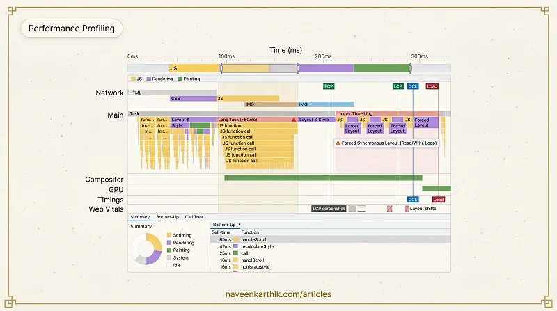
The Timeline Overview
At the top is a summary bar showing CPU activity (yellow = JS, purple = rendering, green = painting). Below it is the flame chart — the main view.
The x-axis is time. The y-axis is the call stack depth. Each bar is a function call; bars stacked below it are functions called from it.
Reading the Flame Chart
The flame chart is organized into tracks:
Network — resource requests as horizontal bars. The color indicates the resource type.
Main — everything on the main thread. This is where you'll spend most of your time. Tasks are shown as gray bars; inside them are JS calls (yellow), style recalculations (purple), layout (purple), paint (green), and compositing (green).
Compositor and GPU — off-main-thread work. Healthy animations show activity here and not on the Main track.
Timings — markers for LCP, FCP, DCL (DOMContentLoaded), and Load events as vertical lines. In newer Chrome versions, you'll also see a Web Vitals track showing the LCP element screenshot, layout shift indicators, and INP interactions.
Navigating the Flame Chart
- Scroll vertically (mouse wheel) to zoom in/out on the time axis.
- Click-drag horizontally to pan across the timeline.
- Click-drag in the overview bar (the thin strip at the top) to select a specific time range and zoom into it. This is the most useful navigation gesture — it lets you focus on one long task or one slow frame.
- W/S keys jump between events. A/D keys move left/right.
The Tabs: Summary, Bottom-Up, Call Tree
After recording, you'll see three analysis tabs at the bottom:
Summary — a pie chart showing time breakdown by category (Scripting, Rendering, Painting, System, Idle). This is your starting point: if "Scripting" is 80%, you have a JS problem. If "Rendering" dominates, you have a layout problem.
Bottom-Up — functions ranked by self time (time spent inside the function itself, excluding its children). This identifies the actual hot function. A function that calls 50 sub-functions might appear heavy in the Call Tree but have near-zero self time — the real cost is in one of those children.
Call Tree — the top-down call hierarchy showing total time (self time + all descendants). Use this to trace which user-facing event triggered the work.
Long Tasks
Any task longer than 50ms gets a red triangle in the top-right corner. These are your primary targets. Click one to zoom in and see exactly which JS function caused it.
The Bottom-Up tab shows functions ranked by total self-time — the time spent in that function excluding its callees. This identifies the actual hot code, not the entry point.
The Call Tree tab shows the top-down call hierarchy. Useful for tracing which user-facing event triggered the long task.
Layout Thrashing in the Trace
Layout thrashing appears as alternating purple (layout) and yellow (JS) bars in rapid succession on the Main track. Each purple block is a forced synchronous layout — the browser had to stop and recalculate because JS read a layout property immediately after writing one.
The flame chart will show the JS function that caused each forced layout, with a warning icon.
Here's what layout thrashing looks like in code — and why the profiler shows those alternating bursts:
Memory Timeline
Enable the Memory checkbox before recording to add a memory track. The heap size line should be roughly stable or gently growing. A sawtooth pattern is normal GC; a line that only rises and never falls is a memory leak.
The Rendering Tab
DevTools → More Tools → Rendering gives live overlays:
- FPS meter — live frame rate and GPU memory
- Paint flashing — green overlays on regions that repainted each frame
- Layout shift regions — blue overlays on elements that shifted
- Scrolling performance issues — highlights non-passive event listeners on scroll containers
Spending an hour really learning the flame chart pays off quickly. The Bottom-Up tab alone will surface hot functions you'd never think to look at. And once you've seen layout thrashing in a trace — that unmistakable purple-yellow-purple-yellow pattern — you'll recognize it in code before it ever reaches the profiler.