Images are the single largest contributor to slow LCP on most sites. Not JavaScript, not fonts — images. A 2MB hero JPEG doesn't block the parser, but it hammers bandwidth, delays your LCP timestamp, and causes layout shift if you forgot to reserve the space. The fixes are well-established and mostly declarative — no build tooling required.
Choosing the Right Format
| Format | Best for | Avg saving vs JPEG |
|---|---|---|
| JPEG | Photos, complex gradients | baseline |
| PNG | Transparency, sharp edges | — |
| WebP | Everything JPEG/PNG does | ~25–35% |
| AVIF | Everything, highest compression | ~40–50% |
| SVG | Icons, illustrations, logos | — |
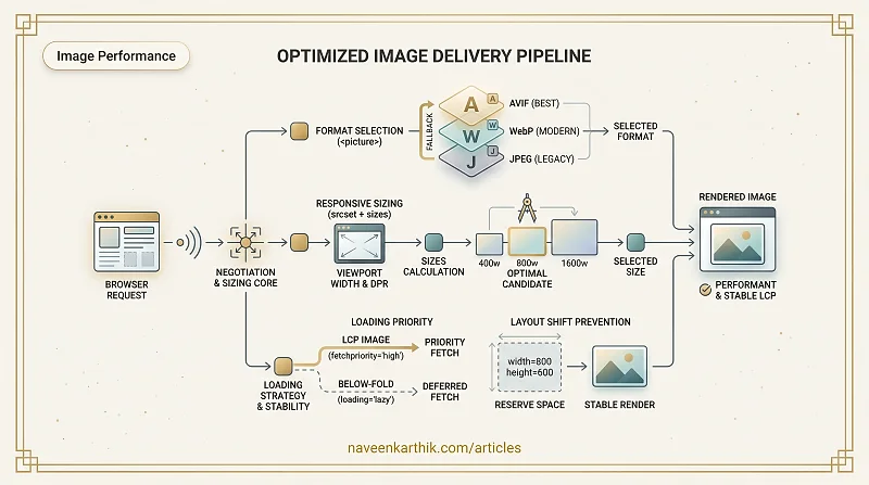
WebP is the safe modern default — supported in all browsers since 2020, with significantly smaller files than JPEG at the same visual quality.
AVIF compresses even further, but encoding is slower and Safari support only became reliable in Safari 16 (2022). Use the <picture> element to serve AVIF where supported and fall back to WebP.
Responsive Images with srcset and sizes
A single large image served to mobile is wasteful. srcset lets you provide multiple sizes; the browser picks the most appropriate one.
Each entry in srcset is URL <width>w — the w descriptor is the intrinsic width of that image file in CSS pixels, not the file size. The browser uses this + sizes + the screen's device pixel ratio (DPR) to pick the best variant.
sizes is a list of media-condition + slot-width pairs. The browser reads them left to right and uses the first matching one:
sizes="(max-width: 600px) 100vw, 50vw"
       ↑ media condition     ↑ slot  ↑ fallback (no media = always matches)
This means: "On screens ≤ 600px wide, this image fills the full viewport width (100vw). On anything wider, it fills half the viewport (50vw)."
The browser then calculates: slot width × DPR = required image width, and picks the smallest srcset candidate that covers it. On a 375px-wide phone at 2x DPR with the first condition matching: 375 × 2 = 750px needed → browser picks the 800w variant. Without sizes, the browser assumes 100vw, and a 2560px desktop monitor at 1x would wastefully download the 1600w image.
In a React/Next.js app, the <Image> component handles this for you — but understanding what it generates helps when you're debugging why a 1600w image is loading on a 375px screen.
Preventing Layout Shift
Images without explicit dimensions cause Cumulative Layout Shift (CLS) — the page jumps when the image loads and the browser reallocates space.
Always set width and height attributes matching the image's intrinsic dimensions. Modern browsers use these to calculate the aspect ratio and reserve space before the image loads.
With both the HTML attributes and this CSS, the browser reserves the correct space without knowing the image's final rendered size.
Native Lazy Loading
loading="lazy" defers loading until the image is near the viewport. It's supported in all modern browsers and requires no JavaScript.
Do not add loading="lazy" to your LCP image (typically the hero). Lazy loading delays it, which hurts your LCP score. Apply it to images that are below the fold.
Decoding
decoding="async" tells the browser it can decode the image off the main thread, without blocking other rendering work. Use it for large non-critical images.
The LCP Image
Your LCP image needs special treatment:
Preload it early in the <head>, give it fetchpriority="high", and never lazy-load it. The LCP image is often the single most impactful change you can make to your LCP score.
Images are one of the rare cases where the web platform's built-in tools are genuinely excellent — srcset, <picture>, loading, fetchpriority all work without a library.
That said, generating and managing all those variants by hand is tedious. Image CDNs like Cloudinary, imgix, or Cloudflare Images can auto-generate WebP/AVIF, resize on the fly via URL parameters, and cache the results at the edge. Next.js's built-in <Image> component does the same at build time. If you're not using one of these, at minimum run your images through a build-step optimizer like sharp or squoosh to produce WebP/AVIF variants.
The hard part is consistency: it's easy to get the hero right and then ship an unoptimized <img> two components down. Making format negotiation and width/height part of your team's code review checklist pays off faster than most performance tooling.