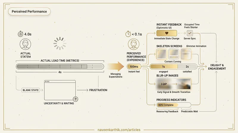
A page can load in 2 seconds and feel slow. Another can take 4 seconds and feel fast. The difference is perceived performance — how fast the experience feels to the user, independent of what the metrics say. Perceived performance is about managing expectation and reducing uncertainty, not just reducing load time.
Why Perception Matters
The human brain judges speed relative to expectations and feedback. Three principles drive perceived performance:
- Occupied time feels shorter — a user watching a skeleton screen feels less wait than a user staring at a blank page.
- Uncertain waits feel longer — a spinner with no feedback is more frustrating than a progress bar showing 60%.
- Early feedback signals progress — showing something immediately, even if incomplete, makes the experience feel faster.
Skeleton Screens
A skeleton screen is a wireframe-like placeholder that mirrors the shape of the content about to load. It tells the user: content is coming, and here's roughly where it will appear.
The shimmer animation suggests activity without implying a specific duration. It's more reassuring than a static gray box.
Optimistic UI
Optimistic UI applies a state change immediately in the UI before the server confirms it. If the server fails, you roll back. The happy path — which is most interactions — feels instant.
This pattern works best for actions with low failure rates and reversible consequences: likes, follows, saves, toggles. Avoid it for destructive or irreversible actions (deletes, payments) where instant feedback without confirmation creates risk.
Progress Indicators
Determinate vs Indeterminate
Use a determinate progress bar when you know the percentage (file upload, multi-step form). It's more reassuring because it signals how long the wait will be.
Use an indeterminate spinner or animated bar when duration is unknown. It signals activity, not progress.
A spinner that spins for more than 3–4 seconds starts feeling broken. Consider switching to a message ("Still loading, large dataset...") at a threshold.
The 100ms Rule
If an action takes less than 100ms to complete, don't show a loading indicator at all. Adding one for fast operations makes the experience feel slower — the indicator appears and immediately vanishes, drawing attention to a wait the user wouldn't otherwise notice.
Blur-Up Image Loading
Show a tiny, blurred placeholder image immediately (often a 20px LQIP — Low Quality Image Placeholder) and transition to the full image when it loads.
The LQIP is typically 200–400 bytes — small enough to inline as a base64 data URL. The user sees the image shape immediately rather than a blank space.
Instant Navigation with Prefetching
React Router and Next.js can prefetch route bundles when a link enters the viewport or on hover. When the user clicks, the bundle is already in cache and the navigation feels instant.
Prefetching is free from a user experience perspective — it happens in idle time. The cost is bandwidth for users who hover but don't click.
Perceived performance is ultimately about respect for the user's attention. Blank screens and unexplained spinners communicate "we're not ready for you yet." Skeletons, instant optimistic feedback, and smooth image transitions communicate "we anticipated your needs." That gap in tone is usually what separates a product that feels polished from one that merely loads fast.