I've seen this pattern repeat enough times that it's worth writing down. A designer hands over a Figma file. An engineer feeds it into Claude via MCP. figma.get_screenshot() looks perfect. figma.get_design_context() and figma.get_metadata() return clean structured data. The generated HTML and CSS comes back inaccurate, inconsistent, or completely wrong.
At first glance that looks like an LLM problem. In reality it's almost always a design structure problem.
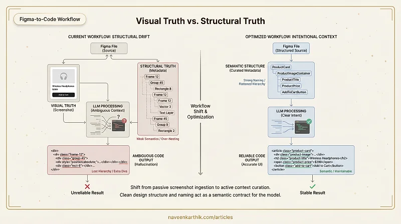
The Core Problem: Visual Truth vs Structural Truth
There are two "truths" in a Figma file.
Visual truth is what figma.get_screenshot() shows — perfect spacing, clean alignment, proper visual grouping, pixel-perfect UI.
Structural truth is what figma.get_design_context() and figma.get_metadata() expose — frame hierarchy, auto-layout configuration, constraints, padding, absolute positioning, group nesting, component structure.
When a Figma file has proper semantic structure — clean auto-layout, meaningful naming, logical hierarchy — the metadata becomes extremely powerful. Combined with the screenshot, it produces accurate and stable UI code. But when semantics are weak — messy nesting, generic names, heavy absolute positioning — that structural data becomes noise. In those cases, the screenshot alone often yields better results than the full design tree.
Frames ≠ HTML Elements
In Figma, everything is a Frame. Components wrap Frames. Auto-layout wraps Frames. Variants wrap Components.
But in real UI you have <section>, <button>, <img>, <header>. There is no 1:1 mapping.
When the model sees:
It cannot reliably determine which frame is layout, which is semantic, and which is purely decorative. That ambiguity leads to extra divs, wrong nesting, lost hierarchy, and over-complicated markup.
Over-Nesting from Design Convenience
Designers often wrap elements in extra frames for spacing, add invisible layers, use groups for alignment, and duplicate components instead of using variants. Visually harmless — structurally disastrous.
A structure like this:
Looks like meaningful hierarchy to the model. But the nesting is artificial — it exists because someone added a padding wrapper or an alignment container that was never meant to become a DOM element.
Structural Drift Between Visual and Logical Hierarchy
Designers optimize for pixel perfection, layout flexibility, and component reusability. Developers need semantic grouping, accessibility hierarchy, and logical DOM order.
When visual grouping differs from logical grouping, the LLM has to guess. And guessing is where hallucination comes from.
Decorative Layers Polluting Context
Background rectangles, overlay masks, vector shapes, and absolute-positioned decorative elements all appear in metadata as full structural nodes. Without filtering, the model may convert them into HTML nodes, misinterpret them as content elements, or inflate the DOM structure — because it has no way to distinguish "this is a background rectangle" from "this is a content container."
Naming is Everything
LLMs rely heavily on token meaning. If your Figma tree says:
You get generic output. If it says:
You get structured, accurate output. Naming acts as semantic metadata. Poor naming doesn't just make the file harder to read — it actively destroys the model's ability to reason about intent.
What We Can Fix
1. Enforce Semantic Naming
Avoid generic auto-generated names like Frame 12, Group 45, Rectangle 8. Use intent-driven names like Navbar, HeroSection, ProductGrid, CTAButton. The name is the contract between the designer and the model.
2. Reduce Artificial Nesting
Before handing a file to MCP: flatten unnecessary frames, remove empty containers, and eliminate layout-only wrappers where possible. Every extra layer of nesting is an opportunity for the model to infer false hierarchy.
3. Separate Decorative Layers
Clearly isolate background layers, visual effects, shadows, and masks so they can be filtered before passing context to the LLM. If decorative elements live alongside content elements with identical structural weight, the model can't distinguish them.
4. Standardize Component Contracts
Define a canonical structure for Button, Card, Modal, and Input components with consistent naming and internal hierarchy. Don't let every page reinvent the structure of a card. Consistent component shape is what lets the model generalize from one instance to another.
What You Cannot Fix
Frames, Components, Auto Layout, and Variants are core to Figma — they can't be removed and shouldn't be. The goal isn't elimination; it's normalization and clarity. You're not trying to make Figma simpler. You're trying to make its structure legible to a machine.
Figma + LLM Is a Workflow Shift
Using Figma with an LLM well isn't about better prompting. It's about controlling what the model sees. Instead of blindly passing the entire design tree, you intentionally curate context. That shift in approach is what changes reliability.
Practical Upgrades
1. Conscious Token Reduction
Most pipelines send full trees including hidden layers, decorative SVGs, images, and unused components. This increases ambiguity and cost.
Instead: remove hidden layers, exclude decorative elements, strip unnecessary wrappers, and pass only meaningful structural nodes. Fewer tokens means lower cost, faster responses, improved reasoning clarity, and reduced hallucination. Token reduction improves reasoning — not just budget.
2. Treat Component Names as Contracts
The old approach: screenshot → "Generate this UI." The better approach: structured design → named components → explicit intent.
When components are clearly named — LoginButton, ProductCard, HeroSection, CheckoutForm — the model reasons from intent instead of pixels. Figma becomes a semantic contract.
3. Multi-Page Awareness
Figma already encodes page names, frame names, and component names. If a button is named GoToCheckout and the target page is named CheckoutPage, navigation intent becomes explicit without any screenshot inference:
On click of GoToCheckout, navigate to CheckoutPage.
That's the kind of instruction the model can execute reliably.
4. Intra-Page Interaction Clarity
Consistent naming makes interaction mapping deterministic. If you have OpenModalButton and SignupModal, the instruction
On click of OpenModalButton, show SignupModal.
is unambiguous. If both were named Frame 23 and Frame 47, the model has to guess — and it will sometimes guess wrong.
5. Responsive Alignment
Instead of sending a single screenshot, provide mobile and desktop structures with matching component names across breakpoints. If ProductCard exists at both sizes, the model understands it's the same component with different layout rules — enabling structural responsive reasoning rather than treating them as two unrelated elements.
6. Intentional MCP Usage
Stop passively accepting raw MCP output. Decide what to extract, decide what to exclude, normalize before passing to the LLM, and leverage component names deliberately. Control the abstraction layer.
The Mental Model Shift
The old way: screenshot → "Build this."
The better way: structured design → clean metadata → explicit contracts → controlled context.
This approach rewards strong naming discipline, cleaner design systems, better interaction modeling, reduced token usage, and higher generation reliability. The point isn't to do more work upfront — it's to do the right work upfront, so the model stops guessing and starts reasoning from structure. A well-structured Figma file isn't just easier for developers to read; it's the difference between an LLM that generates accurate UI code and one that hallucinates half the component tree.