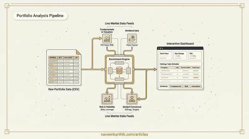
Most portfolio trackers work the same way: you manually key in each stock, keep prices current by hand, and get a static snapshot that's stale the moment you leave. I built the Holdings Analyzer to skip all that — you upload the CSV that Zerodha Console already generates for you, and a full portfolio dashboard appears instantly. Live fundamentals, dividend data, analyst ratings, and risk metrics all pull automatically. No manual entry, no stale numbers.
Getting Started: The CSV Upload
The only input the tool needs is your Zerodha Console holdings export. In Console, go to Portfolio → Holdings, click the download icon, and save the CSV. Drag and drop that file onto the upload screen — or click to browse — and the entire dashboard builds itself from your real positions.
Everything after that is automatic. The tool reads your instrument symbols, quantities, average costs, and last traded prices from the file, then fires background requests to fetch live data for each stock: dividend yields, valuation ratios, risk metrics, and analyst consensus.
If you want to update prices or adjust a position, every field is editable inline directly in the Holdings table. You can also upload a new CSV at any time without losing the session — the "Upload new CSV" chip in the header replaces the data without navigating away.
Overview: The Dashboard at a Glance
The first tab gives you the numbers that matter most without any navigation required.
Six stat cards across the top summarise the portfolio: total capital deployed, current value, total P&L in rupees and percentage, intraday day change, what fraction is in ETFs, and the concentration of your top five positions. The top-five concentration number is worth watching — a portfolio where five stocks represent 70% of value carries very different risk than one where that same capital is spread across twenty.
Below the cards, two charts tell you where the money is and how it's performing. The allocation pie shows your top eight positions by current value, with everything else collapsed into an "Others" slice. The gainers and losers bar chart ranks your top five winners and bottom five positions by absolute rupee P&L — so you can see immediately which individual bets drove your returns and which are dragging.
Holdings: Your Editable Portfolio Table
The Holdings tab is the canonical view of your positions. Every column is sortable — quantity, average cost, last traded price, invested amount, current value, P&L, net change, day change — and every cell is editable. Click any value to change it inline. Stock symbols auto-format to uppercase.
Each row shows the company name and a market cap badge fetched from NSE data. The badge distinguishes large-cap, mid-cap, and small-cap — useful context when you're looking at a portfolio that mixes index heavyweights with smaller positions.
The summary strip at the bottom of the table keeps total invested, total current value, and overall P&L visible no matter how far down the list you scroll.
You can export your full holdings table as CSV at any time using the export button in the header. The downloaded file includes all calculated columns — invested, current value, P&L, net change — not just the raw inputs.
Dividends: Income Tracking
The Dividends tab calculates the annual income your portfolio generates from dividends and makes it easy to see which positions are doing most of the work.
At the top, two cards show your estimated total annual dividend income in rupees and the count of dividend-paying stocks in your portfolio. Below that, a bar chart ranks your top ten holdings by annual income — which combines yield, quantity, and current price into a single comparable number.
The detailed table covers every dividend-relevant data point: current yield, five-year average yield for historical context, payout ratio with a safety badge (under 60% is green, over 80% flags as risky), the upcoming ex-dividend date with orange highlighting for near-term dates, and the calculated annual income for each position.
Yields come from live NSE data but are fully editable. If you have a better source for a particular stock's yield — or you want to model a hypothetical cut or increase — click the yield cell and type in your own value. The income projections update immediately.
Fundamentals: Valuation Metrics
The Fundamentals tab surfaces the equity valuation data that tells you whether your holdings are priced expensively or cheaply relative to their earnings and assets.
Three headline cards give a value-weighted view across your whole portfolio: average trailing P/E, average return on equity, and average revenue growth. Color coding tells you at a glance where each stands — a portfolio P/E under 15 is green, over 25 is red; ROE above 15% is green, negative ROE is red.
The detailed table covers eleven metrics per stock: trailing P/E, forward P/E, price-to-book, EV/EBITDA, PEG ratio, ROE, ROA, net margin, operating margin, revenue growth, and trailing EPS in rupees. Every column is sortable. Every cell is color-coded against sensible thresholds so you can identify outliers without doing the mental arithmetic manually.
Loading skeletons appear while data fetches, and the table gracefully handles missing values for stocks where certain fundamentals aren't reported.
Risk: Volatility and Leverage
The Risk tab quantifies how much market sensitivity and balance-sheet leverage is sitting in your portfolio.
The summary cards give a value-weighted portfolio beta (the aggregate sensitivity to index moves), average debt-to-equity ratio, and a count of high-risk holdings — defined as stocks where both beta exceeds 1.3 and debt-to-equity exceeds 1.5.
The risk table covers each position's beta, 52-week low and high, current price, debt-to-equity, current ratio, and a summary risk flag. The flag has three states: "High" in red when both beta and leverage are elevated, "Watch" in orange when either is elevated, and "Low" in green when both are within safe bands.
The most useful column in the table is the 52-week range visual — a horizontal bar showing where the current price sits between the annual low and high. A dot in the lower third of the range (red) means you're holding a stock that's been selling off hard. A dot near the top (green) means the stock has been strong. It's the fastest way to catch positions that are quietly drifting toward their lows while your attention is elsewhere.
Analyst: Consensus and Price Targets
The Analyst tab aggregates Wall Street and analyst consensus data — recommendation ratings and price targets — across your holdings.
Three cards give a portfolio-wide summary: the average upside to analyst mean price targets (positive means analysts collectively think your holdings are underpriced), the number of Strong Buy ratings, and the number of Sell or Strong Sell ratings. An upside figure above 10% in green versus a negative figure in red gives you a quick read on whether the analyst community is broadly constructive or cautious on your portfolio.
The upside chart visualises the gap between current price and analyst target for each stock as a bar — green for upside, red for downside. The table underneath covers LTP, analyst mean target, the upside percentage, and a recommendation chip that translates the numerical consensus rating into a readable label: Strong Buy, Buy, Hold, Sell, Strong Sell.
Analyst data is one input among many — these are consensus estimates that lag events and carry their own biases. But they're useful as a sanity check, especially when a stock you hold carries a strong "Sell" rating from a large analyst community while you're still holding it at a loss.
Calculators: Planning Ahead
The Calculators section contains four compounding tools for planning future investments rather than analysing existing ones.
SIP Calculator — enter a monthly amount, an expected annual return, and a time horizon. It shows your maturity value, total invested, and wealth gained, with a stacked area chart separating your invested capital from market-generated returns over time.
Lumpsum Calculator — the same calculation for a one-time investment. The compound growth trajectory makes it concrete how long it takes for compounding to do the heavy lifting.
Goal Calculator — work backwards from a target corpus. Enter what you want to have, when you need it, and at what return. It tells you the monthly SIP required. The donut chart breaks down how much of your target you're providing versus how much the market contributes — usually a useful corrective if you're setting an unrealistic goal.
CAGR Calculator — enter an initial investment, a final value, and the number of years. It computes the compound annual growth rate and shows you the growth trajectory. Useful for reverse-engineering what a past investment or index actually returned.
All four calculators use slider inputs with text fallback so you can nudge values precisely without retyping.
What the Data Is and Isn't
Dividend yields, fundamentals, risk metrics, and analyst ratings are fetched from NSE data via a backend service. The data is updated periodically — the header shows how recently it was pulled. The quality varies by stock: large-cap NSE-listed equities have complete coverage; smaller stocks may have missing fields, which the tables handle gracefully rather than showing broken cells.
The tool does not connect to your Zerodha account directly and does not have access to your login credentials. The CSV export you upload never leaves your browser — it's parsed entirely in memory. The only outbound requests are for market data keyed by stock symbol.