Loading assets efficiently is where a lot of page speed is won or lost. Your app logic might be well-optimized, but if fonts block text, a 300KB stylesheet is loaded upfront for a page that needs 15KB, and every script tag fires at parse time — you're leaving significant performance on the table. This article covers fonts, CSS, JavaScript, and lazy loading, with the practical patterns for each.
Font Loading: FOIT, FOUT, and font-display
Web fonts are a common source of invisible or invisible-then-jumpy text. Two terms describe the extremes:
- FOIT (Flash of Invisible Text) — the browser hides text while the font downloads. Users see blank content.
- FOUT (Flash of Unstyled Text) — the browser renders text in a fallback font, then swaps to the web font when it arrives. Users see a layout shift.
The font-display CSS descriptor controls this behaviour:
| Value | Behaviour |
|---|---|
auto | Browser default (usually FOIT) |
block | Short FOIT, then unlimited wait |
swap | Immediate FOUT, unlimited wait |
fallback | Very short FOIT, short swap window |
optional | Very short FOIT, no swap — font only used if cached |
Recommended approach for body text: font-display: swap with a well-matched fallback font to minimise layout shift.
Recommended approach for icon fonts: font-display: block — unstyled icons are worse than invisible ones.
Additionally, preload your critical fonts so they start downloading early:
The as attribute tells the browser what kind of resource this is so it can apply the correct priority and Content-Security-Policy. The crossorigin attribute is required for fonts because the browser fetches fonts via CORS — without it, the preloaded font and the actual font request won't match, and the font will be downloaded twice.
Critical CSS vs Non-Critical CSS
CSS is render-blocking. The browser won't paint until all linked stylesheets are processed. Loading 300KB of CSS for a page that only needs 10KB above the fold is a costly default.
Critical CSS is the minimal set of styles needed to render above-the-fold content — layout, typography, hero section. It should be inlined in <head>:
Non-critical CSS — everything else — is loaded asynchronously after the initial render:
The media="print" trick causes the browser to download the stylesheet without blocking render. The onload handler switches it to all once it arrives.
Tools like critical can automate critical CSS extraction at build time.
JavaScript Loading Patterns
Beyond async and defer, there are higher-level patterns for loading JavaScript efficiently.
Module/Nomodule Split (Legacy)
If you need to support Internet Explorer or very old browsers, serve modern ES modules to modern browsers and a bundled fallback to legacy ones:
Modern browsers download and execute the module script (which is deferred by default) and ignore nomodule. Legacy browsers do the opposite. This eliminates transpilation overhead for the majority of users.
Today, this pattern is largely unnecessary. ES modules and the features they imply (arrow functions, const/let, Promises) are supported by 96%+ of global browsers. Unless your analytics show a meaningful IE11 user base, you can drop the legacy bundle entirely.
Third-Party Script Loading
Third-party scripts (chat widgets, analytics, A/B testing) are a common performance liability. Strategies:
For embedded widgets (YouTube videos, maps), use a facade pattern — show a static preview image, then swap in the real embed only when the user clicks.
Lazy Loading: Images, Components, and Routes
Loading everything upfront is wasteful. Lazy loading defers resources until they're actually needed.
Images
The native loading="lazy" attribute tells the browser to defer offscreen images until they're near the viewport:
Do not lazy load above-the-fold images — especially the LCP image. That delays the metric that matters most. Instead, give the LCP image the highest priority:
Also consider adding decoding="async" to non-critical below-fold images — it tells the browser to decode the image data off the main thread, keeping the main thread free for more urgent work.
For serving different image sizes to different screens, use srcset and sizes. See article #11 for the complete guide to image optimization.
Components (React / Vue / etc.)
Dynamic imports allow splitting component code into separate chunks:
The chunk for HeavyChart is only downloaded when the component is first rendered. Combined with Intersection Observer, you can trigger the load only when the component is near the viewport. See React Suspense for how the fallback mechanism works.
Routes
Route-based code splitting is the highest-value lazy loading technique. Each route gets its own chunk, and users only download code for the pages they visit:
Most modern frameworks (Next.js, Nuxt, SvelteKit) do this automatically.
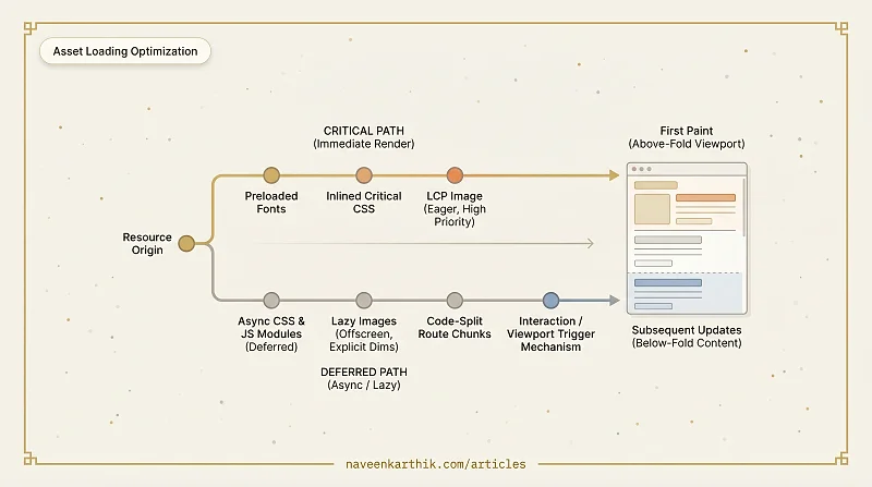
Putting It All Together
A well-optimised loading strategy looks like this:
- Fonts: preloaded,
font-display: swap, matched fallback font - CSS: critical styles inlined, non-critical loaded async
- JS: all app scripts deferred, third-party scripts lazy-loaded
- Images:
loading="lazy"on all below-fold images with explicit dimensions; LCP image eagerly loaded - Routes/Components: code-split at the route level, heavy components lazy-loaded with Suspense
Each layer reduces work on the critical path. The pattern is consistent: get the minimum required for first paint to the browser as fast as possible, and pull everything else in on demand. Apply it systematically and you'll often see LCP drop by seconds without touching a single line of app logic.